Role
Product Designer
User Researcher
Business Analysis
Self-initiated Project
Team
Duration
My Contributions
April - July 2023
Led End-to-End Design
User Research
Design and Iterated UI/UX
Developed Competitive analysis

Turning Online Matches into Real-Life Moments.


+
TL:DR
The Problem with Online Dating Today
"I wasn’t struggling to get matches—I was struggling to turn those matches into something real."
That’s what my friend said after another frustrating dating app experience—plenty of matches, but conversations quickly faded. This common issue revealed a gap in the massive online dating market. I set out to reimagine online dating, creating a solution that fosters real connections while driving engagement.
My Solution:Turning Matches into Real-Life Moments
Twinkle isn’t just another dating app—it stands out with three key features that keep users engaged and help turn matches into real connections.—it stands out with three key features that keep users engaged and help turn matches into real connections.
Compatibility & Profile Exploration
Explore others’ profiles in full before deciding—because every detail matters when making meaningful connections!
Interest-driven chat prompts
Twinkle helps you find topics to talk about, making conversations smoother and more engaging right from the start!
Milestones: Structured interaction incentives
Twinkle unlocks different content on specific days, guiding users through a structured journey toward deeper connections.
Magic Ticket: Seamless transition to real-life dates
The Magic Ticket unlocks exclusive real-world date experiences, giving users the perfect reason to go on a date.
My research revealed the major frustrations users face on existing dating platforms, guiding us to design a more thoughtful and engaging solution for building genuine connections.Based on the data I found out:
Massive Market Potential for Online Dating
A Significant Portion of Users Seek Genuine Connections


Deep Dive into Online Dating
The Downside of the Current Dating App Model

Key Takeaways from User Interviews


📌 Shallow Conversations – Users struggle to move beyond surface-level chats, making it hard to build meaningful connections.
📌 Long-Term Relationship Challenges – Many users are actively seeking serious relationships but lack the tools to find like-minded partners.
📌 Decision Fatigue – An overwhelming number of choices creates swiping fatigue, leading to disengagement and dissatisfaction.
redesign online dating experiences to help users seeking real relationships build deeper, more meaningful connections?
How Might We
Ideation
I began by exploring various ways to encourage deeper connections and reduce superficial interactions. I considered different engagement strategies and I evaluated each idea based on: Impact on user engagement / Ease of implementation / Business viability

After weighing these measurement,I fined our focus to three high-impact solutions

Testing & Refining
This section visualizes early design concepts with hand-drawn sketches and wireframes. In the first iteration, I translated the initial concepts into basic wireframes, but identified the need for clearer milestone progress and reward unlocking

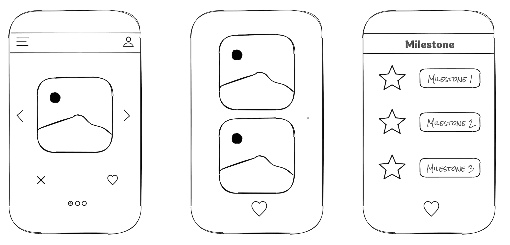
Testing 1.0
In Testing 1.0, I explored various mechanisms and fundamental interactions to identify approaches that would effectively increase user engagement within the app.


Design A: Tags are shown on the main screen
Design A: The selection button is displayed on the homepage.
Design A: presents all milestones (Days 0, 3, 5, and 7) at once.
Design B: Displays a single day (Day 0) to indicate the starting point of the user's progress
Design B: Tags are placed within the profile details
Both designs are not ideal because user feedback indicated a desire to see progress, but neither provides a clear visual representation of the progression.


Design B: The selection button only appears on the profile page.


Choosing Design B encourages users to fully explore each profile before making a decision. This approach aims to improve match quality.
Design A reduces cognitive load by giving users a quick sense of the person before opening the profile, and it also received the majority of votes from users
Testing 2.0

I wish there was a little animation or notification each time I completed a milestone, just to celebrate the progress.
I see different scenes for each milestone, but I’m not sure what I’ll unlock at each stage. Some hints would make it more exciting.
I’m not sure which stage I’m currently on; it would be helpful to have some indication of my current progress.
“
“
“
BEFORE
AFTER
After finalizing the design variations, I conducted another round of usability testing to evaluate the overall flow and ensure it felt intuitive. This testing focused on users' feelings and experiences while completing a specific task.


Each milestone stage is represented by a unique scene, making it easy for users to understand and remember each step in the journey.
Added teaser texts like “Dive into their favorite sounds” to motivate continued engagement.
Added a "kept in touch for X days" indicator and unlock button to show progress and engage users.
Encouraging Real Conversations
It would be even better if the interface could show more clearly how close we are to reaching each milestone.
BEFORE


“
“
I've seen similar features on other apps, and honestly, it doesn't seem that effective in conversations.
AFTER
Gradient colors now show milestone progress, making it easier for users to see chat advancement.


Prompts are tailored to shared interests, creating more relevant conversations.
Enhancing Milestone Engagement
Prompts vary by topic, adding variety and keeping chats engaging.